
SME · Food industry · Protective equipment
Dispoguard: a PPE brand that speaks to operators, not just to standards
With art director Elsa Migot(opens in a new tab), IA Marketing overhauled the Dispoguard brand, from the brand platform to the packaging and the catalogue.

- Client
- Dispoguard
- Sector
- Protective equipment for the food industry
- Period
- 2026
- Art direction
- Elsa Migot
In brief · 6 min read
- The question
- How do you stand out when the whole sector talks about standards?
- The recommended choice
- People make the difference, standards provide the proof
- The result
The choice, its reasons, its trace · Dispoguard
- Starting situation
A personal protective equipment (PPE) brand for the food industry, in a sector where everyone communicates about standards.
How do you stand out when the whole sector talks about standards?
- Reasoned choice
IA Marketing’s recommendation, with art director Elsa Migot
People make the difference, standards provide the proof
- Market research: competition, PESTEL, targets and personas, customer journey
- A benchmark of the sector’s visual identities
- Three illustrated directions and ten taglines, graded against the brand’s four values
Team recommendation - Observable work
The “Unlocks potential” tagline and a motivational line on every pack speak to the operators.
- New brand guidelines
- Eco-designed packaging
- The 2026 catalogue
Work delivered - Documented resultResult not measured
A PPE brand for the food industry
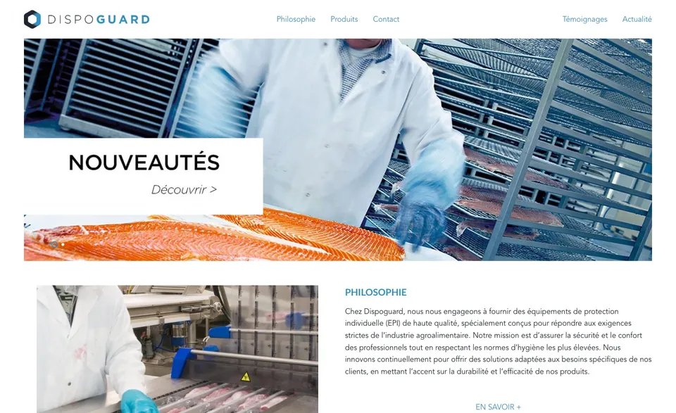
Dispoguard designs personal protective equipment (PPE) for the food industry: gloves, footwear, hearing protection, workwear. After the overhaul of its brand platform and visual identity, new products and materials are on their way. They need to speak with one voice.
How do you stand out when the whole sector talks about standards?
A sector ruled by standards
Competitors communicate about standards and regulations: the catalogues all look alike.
Two audiences, two readings
Operators open the boxes; safety, quality and purchasing managers read the catalogue.
Materials to harmonise
Each new product must carry the same identity, despite dense text and mandatory pictograms.
“Some operators wear a hairnet that doesn’t cover all of their hair, which is a real risk when it comes to foreign bodies.”
People make the difference, standards provide the proof
The market research supplied the criteria for the choice. IA Marketing carried it out with its AI marketing agent: hundreds of pages of analysis to understand the environment, spot the frictions on the ground and prepare the options.
- The WHY and the tone
- Competition and its map
- PESTEL
- Success factors
- Targets and personas
- Product (4Ps) and customer journey (4Cs)
- Offering and distribution
Elsa Migot complemented it with a benchmark of visual identities and a review of imagery. She then translated the positioning into three illustrated directions, to compare.



Ten tagline proposals were compared. Each was rated against the brand’s four values. The choice fell on “Unlocks potential”.
The key trade-off
Speaking to the people who wear the products
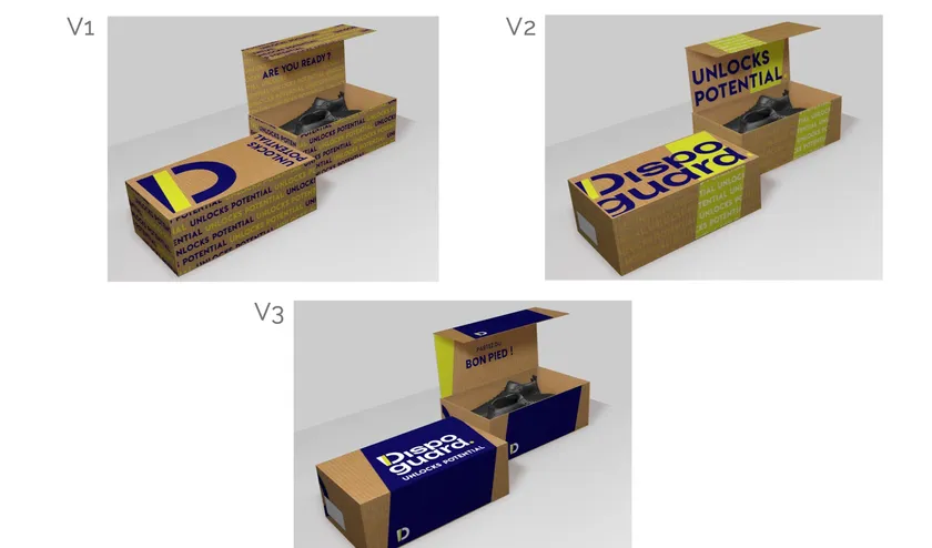
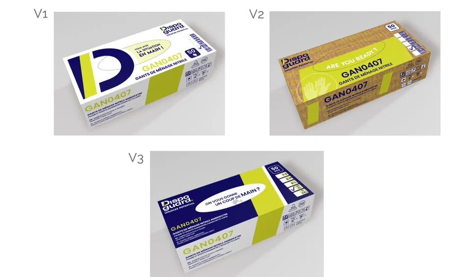
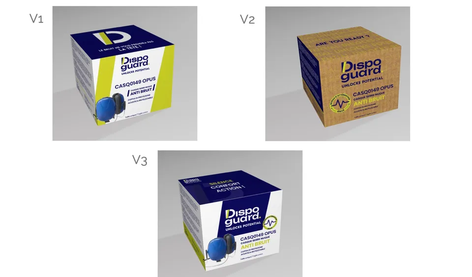
In a sector where everyone communicates about standards, Dispoguard speaks first to operators. The “Unlocks potential” tagline and a motivational line on every pack speak to them directly: “Are you ready?”, “Partez du bon pied !” (Get off on the right foot!), “On vous donne un coup de main ?” (need a hand?). The standard remains present, as proof.
Four values, one dial
Innovation, responsibility, movement, safety. Depending on the material, the dial moves from innovation to the human approach.
Eco-designed packaging
Unprinted cardboard base, two-colour printing, transparent sachets: less ink, a sober finish.
The slash, the brand’s mark
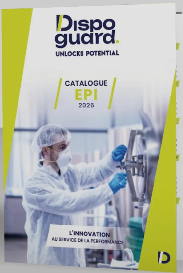
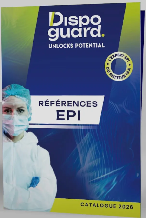
The green slash, repeated at every scale: on the boxes, on the cover, to underline key words.
A catalogue organised by benefit
Cut resistance, noise reduction, grip: products are classified by benefit, with room for voices from the field.
A distinct segment, spotted in the data
The key trade-off
Temporary workers, a need of their own
The audit cross-referenced data from DREES (the research, studies, evaluation and statistics directorate of the French health and social affairs ministries) with public documents. The AI prepared the reading of these sources; IA Marketing analysed them. The analysis brought out a need specific to temporary agency workers. The brand drew a dedicated proposition from it, along with leads for developing its product mix.
- Framework contracts won thanks to a proposition dedicated to the segment identified.
- A new product in preparation, to help workers wear their PPE better.
“IA Marketing’s in-depth analysis improved our knowledge of the market. The marketing analysis enabled us to seize new opportunities by winning a new customer, and also to improve our product mix.”
Who did what
IA Marketing
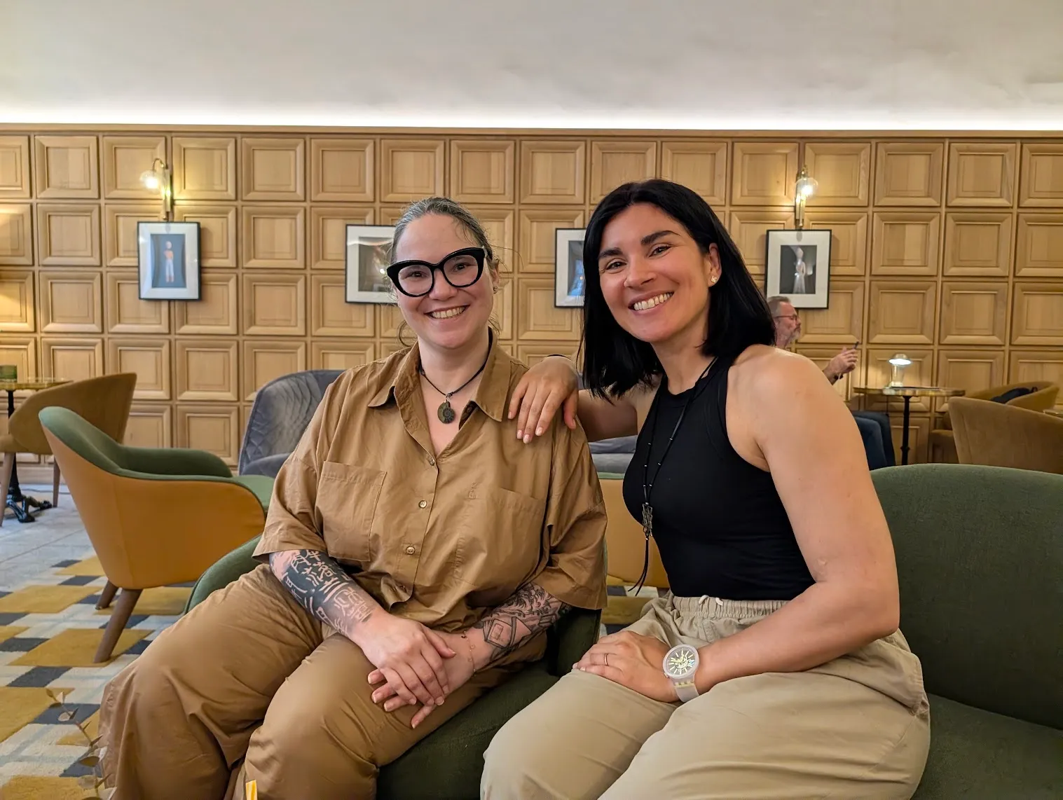
Market research with the AI marketing agent, brand platform: values, tone, tagline. Coordination of the materials.
Elsa Migot
Art direction: benchmark of identities, review of imagery, three directions, visual identity and options for the materials.
elsamigot.com (opens in a new tab)Dispoguard
Product and regulatory constraints, choice of options and sign-off.
From the packaging to the 2026 catalogue
 Before
- A blue hexagonal logo, a thin typeface
- A message centred on quality and hygiene standards
- Workshop visuals, with no brand tagline
 After
- A bold logo, a green slash and dot
- The “Unlocks potential” tagline and lines written for operators
- Purple and green, carried across every material
The new brand guidelines
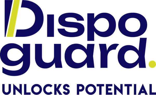


- Dispoguard indigo#131771
- Neon green#DDDE36
- White#FFFFFF
The identity rolled out
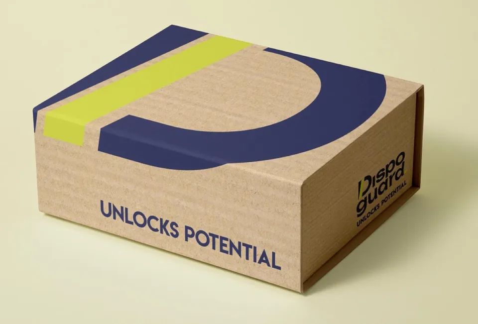
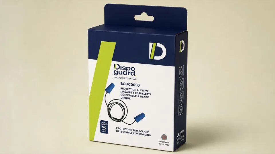
Three options for each pack (footwear, gloves, sachets, ear defenders) and two options for the catalogue, which is aimed at safety, quality and purchasing managers.
What the collaboration changed
- Smooth project management between marketing and art direction.
- Fewer back-and-forths with the client: irritants clearly identified, graphic choices justified.
- A shared context: BAM, IA Marketing’s proprietary platform, as SaaS or managed, keeps the research and the positioning within reach of marketing and art direction alike.
The commercial effects will be documented once the materials are in circulation. The project served as a case study for the masterclass “DA & marketing au temps de l’IA” (art direction and marketing in the age of AI), led by Lydie Catalano and Elsa Migot at Bellecour École(opens in a new tab) in June 2026.
From choosing the options to the 2026 range
- Choose and combine the options, pack by pack.
- Adjust the titles, the colours and the typefaces.
- Add the final high-definition photos.
- Roll out the technical pictograms across every product in the catalogue.
After the Dispoguard case
Should your brand speak to the people who use your products?
A 30-minute scoping call: the decision to make, the scope, the possible next step.
Nordways
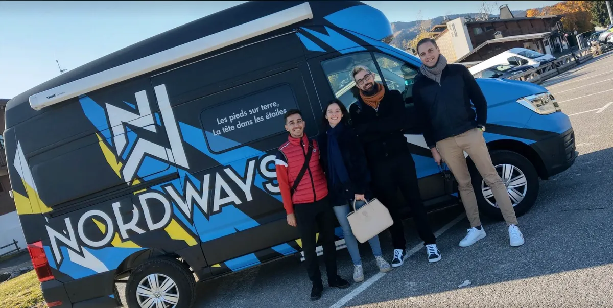
After COVID, hospitality, luxury and the Meilleurs Ouvriers de France (a French distinction recognising excellence in skilled trades) rather than the medical sector
+60% net margin, +45% productivity
Poterie du Bousquet
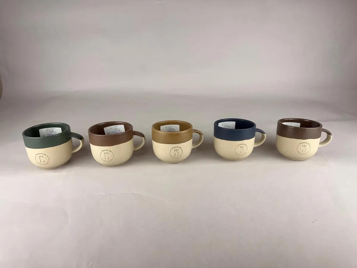
Choosing a signature colour in a category with no clear signature
13 stands assessed in 65 minutes at a trade show
Case study in FrenchWhat next?
What comes next for your project?
Scoping call
A decision close to this case?
Thirty minutes to place your project: the issue, the scope and the possible next step. This is not a product demo.
Managed service
Talk to our team about running your marketing
The IA Marketing team runs your marketing projects in BAM, IA Marketing’s proprietary platform, as a managed service. Your team checks, validates and decides.